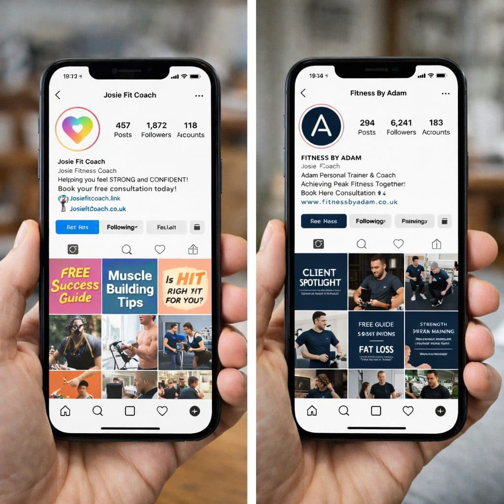
In today’s digital landscape, the necessity for a website that looks great and functions seamlessly across all devices cannot be overstated. With the proliferation of smartphones, tablets, laptops, an
In today’s digital landscape, the necessity for a website that looks great and functions seamlessly across all devices cannot be overstated. With the proliferation of smartphones, tablets, laptops, and desktops, ensuring your website is accessible and visually appealing on any screen size is crucial. Responsive web design (RWD) is the solution to this challenge, offering a way to build websites that adapt to the varied ways users access the internet. Here’s a closer look at how responsive web design can elevate your online presence and why it’s essential for your business.
The Importance of Responsive Web Design
Enhanced User Experience
User experience is paramount. A responsive design ensures that your website provides a consistent and intuitive experience, regardless of the device being used. This means smoother navigation, quicker load times, and content that is easy to read without excessive scrolling or zooming.
Improved SEO Performance
Search engines like Google prioritise mobile-friendly websites. A responsive design can improve your search engine ranking, making it easier for potential customers to find you. Google’s algorithm favours websites that offer a good user experience on mobile devices, which means a responsive design can directly impact your visibility and traffic.
Cost-Effectiveness
Maintaining separate websites for desktop and mobile users can be costly and time-consuming. Responsive web design allows you to manage a single site that serves all devices, streamlining updates and maintenance and reducing overall costs.
Future-Proofing Your Website
Technology and user behaviour are always evolving. Responsive web design provides a level of future-proofing, ensuring your site can handle new devices and screen sizes as they emerge. This flexibility is crucial for staying current in a rapidly changing digital environment.
Key Elements of Responsive Web Design
Flexible Layouts
Using a flexible grid layout is a cornerstone of responsive web design. This approach allows your website’s layout to adjust dynamically based on the screen size and orientation of the device. CSS Grid and Flexbox are popular tools for creating these flexible layouts.
Responsive Images and Media
Images and media should scale with the size of the screen without losing quality. Techniques like CSS media queries and the <picture> element in HTML can help ensure that images look great on all devices, from high-resolution desktops to smaller smartphone screens.
Media Queries
Media queries are a CSS feature that allows you to apply different styles based on the characteristics of the device, such as its width, height, or resolution. By using media queries, you can create a tailored user experience for various devices.
Mobile-First Design
Adopting a mobile-first approach means designing the mobile version of your site first and then scaling up for larger screens. This strategy ensures that the core functionality and aesthetics are preserved on smaller devices, which often have more constraints.
Implementing Responsive Web Design
Understand Your Audience
Knowing your audience’s preferred devices and usage patterns can guide your responsive design strategy. Use analytics tools to gather data on what devices your visitors use and tailor your design to meet their needs.
Testing Across Devices
Regular testing on different devices and screen sizes is essential to ensure your site looks and functions as intended. Emulators and online tools can help, but real-world testing on actual devices is invaluable.
Continuous Improvement
Responsive web design is not a one-time task but an ongoing process. Regularly update your site based on user feedback and technological advancements to maintain an optimal user experience.
Conclusion
In an era where the digital experience is paramount, responsive web design stands as a critical component of successful web development. By ensuring your website looks great and performs well on every device, you not only enhance user satisfaction but also improve your SEO performance and future-proof your online presence. Embrace the principles of responsive design and watch your website become a versatile, user-friendly hub for all your digital interactions.
Ready to transform your website into a responsive powerhouse? Contact us at awmedia.marketing and let’s create a site that looks fantastic on every device, reaching your audience wherever they are.