You’ve got a website. Or you’re thinking about getting one. But here’s the question that actually matters: is it bringing in clients, or is it just sitting there looking pretty whilst you’re still cha
You’ve got a website. Or you’re thinking about getting one.
But here’s the question that actually matters: is it bringing in clients, or is it just sitting there looking pretty whilst you’re still chasing people on Instagram?
Most personal trainer websites fall into the second category. They exist. They look okay. But they don’t convert visitors into paying clients.
After building over 200 websites for fitness professionals, I can tell you exactly what separates websites that make money from websites that waste money.
The Problem With Most Fitness Websites
Most PT websites fail for the same three reasons:
They’re too slow. Your site takes 8 seconds to load on mobile. The average person gives you 3 seconds before they leave. You’re losing people before they even see your content.
They’re confusing. Five different services. Three different call-to-action buttons. A blog with two posts from 2022. Visitors don’t know what you do or what they’re supposed to do next.
They look like everyone else. You bought a template. So did 50 other trainers in your area. Potential clients recognise it instantly. It tells them you didn’t invest in your business, so why should they invest in you?
The result? People land on your site, spend 10 seconds looking at it, and decide to work with your competitor instead. Not because you’re not good at what you do. Because your website makes them think you’re not.
What Your Website Actually Needs to Convert
Forget fancy animations. Forget video backgrounds. Forget trying to be clever.
Here’s what actually converts visitors into clients:
Fast loading speed. Under 3 seconds on mobile. This isn’t negotiable. Google will literally punish you in search rankings if your site is slow, and visitors will leave before your page even loads.
Clear headline that speaks to a pain point. “Are you tired of starting diets and quitting three weeks in?” beats “Welcome to my fitness coaching business” every single time. Lead with their problem, not your qualifications.
Social proof immediately visible. Testimonials, transformations, results. People buy proof, not promises. Show them someone like them who got results working with you.
One clear call to action. Not five buttons saying different things. One clear next step: “Book your free consultation” or “Apply here” or “Start your transformation”. Pick one and make it obvious.
Mobile optimisation. 70% of your visitors will view your site on their phone. If it’s a mess on mobile, you’ve lost 70% of potential clients before they read a single word.
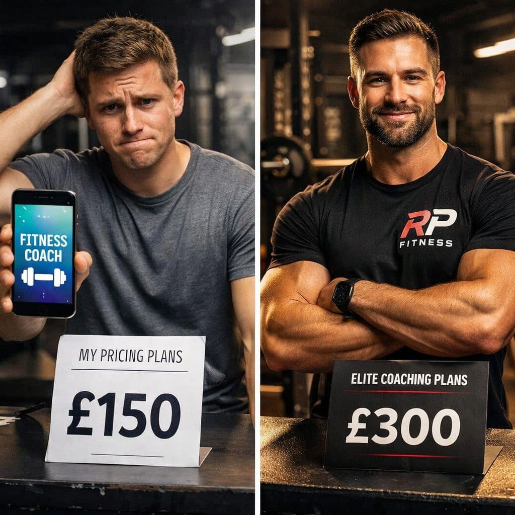
Professional design that matches your pricing. If you’re charging £200 per month for coaching, your website better not look like it was made in 2010. Your online presence should reflect the quality of service you provide.
The Homepage That Converts
Your homepage has one job: get people to take the next step. That’s it.
Here’s the structure that works:
Hero section: Clear headline addressing their pain point. Subheading explaining how you solve it. One call-to-action button. This takes up the full first screen.
Social proof: Three to five testimonials or transformation results. Not hidden on a separate page. Right there on the homepage where people can see them immediately.
Your method: Brief explanation of how you work. Not your life story. Not your qualifications. How you take someone from where they are to where they want to be.
More social proof: Before and after photos. Client results. Video testimonials if you have them. The more proof, the better.
Call to action: “Ready to start? Book your free consultation.” Make it obvious. Make it easy.
That’s it. No 17 different sections. No blog feed nobody asked for. Just the information someone needs to decide whether to work with you.
The About Page That Actually Sells
Your About page shouldn’t be your life story.
Nobody cares that you got into fitness because you were bullied at school. Nobody cares that you have 15 certifications. They care about whether you can help them.
Here’s what your About page should do:
Establish credibility quickly. Relevant experience, qualifications that matter, results you’ve achieved for clients. Two to three sentences maximum.
Show you understand their problem. This is where you demonstrate you’ve worked with people like them before. You understand their struggles because you’ve solved them dozens of times.
Explain your approach. How you work. What makes you different. Why your method gets results when others don’t.
Give them the next step. Another call to action to book a consultation or enquiry call.
The best About pages read less like a CV and more like “I know exactly what you’re going through, here’s how I help people like you, let’s talk.”
The Services Page That Doesn’t Overwhelm
Too many trainers list 17 different services trying to appeal to everyone.
Online coaching. In-person training. Group sessions. Corporate wellness. Sports nutrition. Injury rehabilitation. Pre-natal fitness. Post-natal fitness. Competition prep.
Potential clients land on that page and think “they don’t specialise in anything” or “I don’t know which one I need.”
Instead, focus on one to three core services maximum. Explain clearly:
- Who it’s for
- What they get
- What results they can expect
- How much it costs
- How to get started
If you must list multiple services, separate them clearly with distinct pages for each. Don’t throw everything on one page and hope people figure it out.
The Contact/Booking Page That Removes Friction
Make it stupidly easy for people to contact you or book a call.
Not a contact form with 15 fields asking for their life story. Not a “send us an email” with no other option. Not a phone number with no indication when you’re available.
Embedded calendar where they can book directly into your schedule. Contact form with three to five fields maximum. WhatsApp button if you’re active on WhatsApp. Multiple ways to reach you, all clearly visible.
The fewer steps between “I want this” and “I’ve booked a call”, the more clients you get.
What You Don’t Need
A blog you never update. If you’re not committed to publishing weekly, don’t have a blog section with two posts from 2022. It makes you look inactive.
Seventeen pages of content. Most trainers need a homepage, about page, services page, and contact page. That’s it. More pages don’t mean more conversions.
Stock photos of people who aren’t your clients. Real photos of you, your training space, and your actual clients (with permission) beat generic stock images every time.
Fancy animations that slow your site down. That parallax scrolling effect looks cool but adds 3 seconds to your load time. Not worth it.
Music or videos that autoplay. Nobody wants that. It’s 2025. We’re past this.
Common Mistakes That Kill Conversions
Hiding your prices. If you don’t list your prices, people assume you’re expensive. If you are expensive, own it. If you’re not, tell them. Either way, being upfront converts better than making people enquire just to find out.
Too much text. People skim. They don’t read every word. If your homepage is 3,000 words of text, most of it won’t be read. Keep it concise. Get to the point.
No clear path to action. Every page should have an obvious next step. If someone reads your About page and has no idea what to do next, you’ve lost them.
Looking amateur. Typos, broken links, images that don’t load properly. These tell potential clients you’re not professional enough to coach them.
Being too humble. This is your website. It’s literally designed to sell your services. If you’re not comfortable talking about your results and why you’re good at what you do, hire someone to write your copy.
The Technical Stuff That Matters
Site speed: Under 3 seconds loading time. Test it on Google PageSpeed Insights. If it’s slower, fix it.
Mobile responsive: Must work perfectly on all device sizes. Not “kind of works” on mobile. Perfectly.
SSL certificate: That little padlock in the address bar. Required for security and SEO. If your site says “Not Secure”, people won’t trust it.
SEO basics: Page titles, meta descriptions, proper heading structure, image alt text. These help you rank on Google.
Contact form that actually works: Test it yourself. Send yourself an enquiry. Does it come through? Does it go to spam? Fix it if it doesn’t work.
What Actually Drives Conversions
After building hundreds of fitness websites, these are the factors that make the biggest difference:
Credibility: Do you look like someone worth paying money to? Professional photos, real testimonials, results people can see.
Clarity: Can someone understand what you do and who you help within 10 seconds of landing on your site?
Trust: Do you demonstrate you understand their problem and have solved it for others?
Simplicity: Is there one clear path to working with you, or are they confused about what to do next?
Speed: Does your site load fast enough that people don’t leave before seeing it?
Get these five things right and your website will convert. Ignore them and it won’t matter how nice your site looks.
What to Do Next
If your current website isn’t bringing in clients, ask yourself these questions:
Does it load in under 3 seconds on mobile? Is the headline immediately clear about who you help and what problem you solve? Are there visible testimonials or results on the homepage? Is there one obvious call to action? Does it look professional enough to justify what you charge?
If you answered no to any of these, that’s what needs fixing.
Your website should work for you whilst you’re coaching clients, training, or spending time with family. It should bring in leads consistently without you having to chase people on Instagram.
If it’s not doing that, it’s not doing its job.