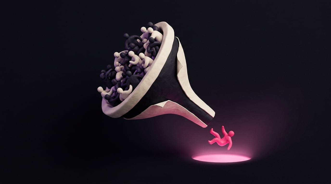
It's not your CTA colour. It's not your hero image. It's not your copy. It is your positioning, and no button tweak on earth will save a homepage that doesn't say who you help.
Your website is not converting. You have, in order: A/B tested the button colour, rewritten the hero headline three times, added a chat widget, added a popup, removed the popup, hired a copywriter, sacked the copywriter, blamed the traffic. The problem is none of those.
The reason your website is not converting is positioning. Specifically, in the first 3 seconds on your homepage, I cannot tell who you help, what you do, and why I should care. No CTA tweak fixes that. You do not have a conversion problem. You have a clarity problem dressed up as a conversion problem.
The 3-second test
Open your homepage. Show it to a stranger for 3 seconds, then close the tab. Ask them three questions:
- 1Who is that website for?
- 2What does the business actually do?
- 3Why should you care, today?
If they cannot answer all three, your hero section has failed and nothing below it will fix that. Visitors do not scroll to figure out what you do. They leave to figure out what someone else does.
Why "we are a passionate team" copy fails
Walk down any UK high street website and you will find the same headline rotation. "We are a passionate team of digital experts." "Crafting bespoke solutions for ambitious brands." "Where creativity meets results."
None of these tell me who you help or why it matters. They describe how you feel about yourself. Visitors do not care how you feel about yourself. They care whether you can solve the specific problem they came here with.
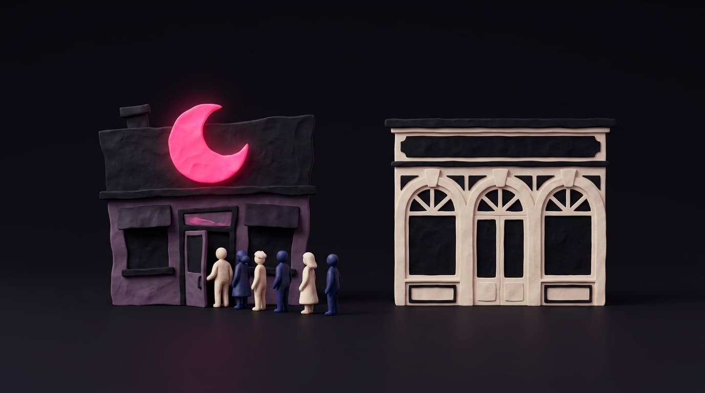
Compare to a sharp version. "We build websites for UK dental practices that fill the diary in 30 days." In 14 words I know the audience (dental practices), the deliverable (websites), the outcome (full diary), and the timeframe (30 days). I instantly self-select. If I am a dentist, I keep reading. If I am not, I leave, and that is fine, because I was never going to buy.
The structural reasons most homepages flop
Pop the hood on a non-converting homepage and you will almost always find the same four sins.
- Vague hero. The headline could belong to any business in any industry. Generic equals invisible.
- Scattered service mention. "We do design, branding, SEO, ads, web, video, strategy." Pick a lane. A confused visitor is a lost visitor.
- Weak proof. One stock testimonial, no logos, no numbers, no faces. Belief needs evidence.
- Buried CTA. The only thing you want them to do is at the bottom of the page, with three competing CTAs above it. Decide what the next step is and make it obvious.
The fix (and it is structural, not cosmetic)
Stop tweaking. Audit. Your hero section needs to do four jobs in roughly 30 words.
- 1Name the audience. Who is this for.
- 2Name the outcome. What changes because of you.
- 3Name the mechanism. What you actually do to make that happen.
- 4Name the next step. One button. Not three.
Write that on a piece of paper before you touch the website. If it reads weak on paper, it reads weak online, no matter how nice the photography is.
The uncomfortable truth
Most rebuilds are positioning projects pretending to be design projects. Owners hire an agency hoping that prettier pixels will rescue a muddled message. They never do. A bad message in great design is a bad message in great design.
Fix the message first. Then make it beautiful. In that order.