Your logo is the first thing potential clients see. On your website, on your social media, on your business cards. If it looks amateur, they assume your business is amateur too. I’ve designed hundreds
Your logo is the first thing potential clients see. On your website, on your social media, on your business cards. If it looks amateur, they assume your business is amateur too.
I’ve designed hundreds of logos for fitness professionals over the years. And I can spot the common mistakes from a mile away.
The Grunge Fitness Logo Problem
Every time I see another fitness logo with distressed text, a barbell, and some grunge textures, I die a little inside. It’s 2024. This look is overdone and outdated.
The fitness industry is especially guilty of this. Everyone wants to look tough and hardcore. So they all end up with the same style of logo. Which means nobody stands out.
What Makes a Logo Actually Work
A good logo needs to work everywhere. On your website. On a business card. On a tiny app icon. On a massive banner.
If your logo falls apart when you make it small, it’s not a good logo. If it only looks good in one color, it’s limiting your brand.
The Text-Heavy Logo Trap
I see this constantly with online coaches. They try to cram their entire business name, tagline, and credentials into their logo.
Your logo isn’t your business card. It’s a mark. A symbol. Something people recognize quickly.
Some of the most successful brands in the world have incredibly simple logos. Because simple works.
Color Choices That Actually Matter
Red and black seems to be every fitness brand’s go-to. It’s aggressive. It’s bold. It’s also what everyone else is doing.
Your brand colors should reflect your actual brand personality. If you’re all about community and making fitness accessible, maybe aggressive red and black isn’t the right choice.
Think about your ideal client. What would appeal to them? What would make them feel like your brand is for them?
The DIY Logo Danger Zone
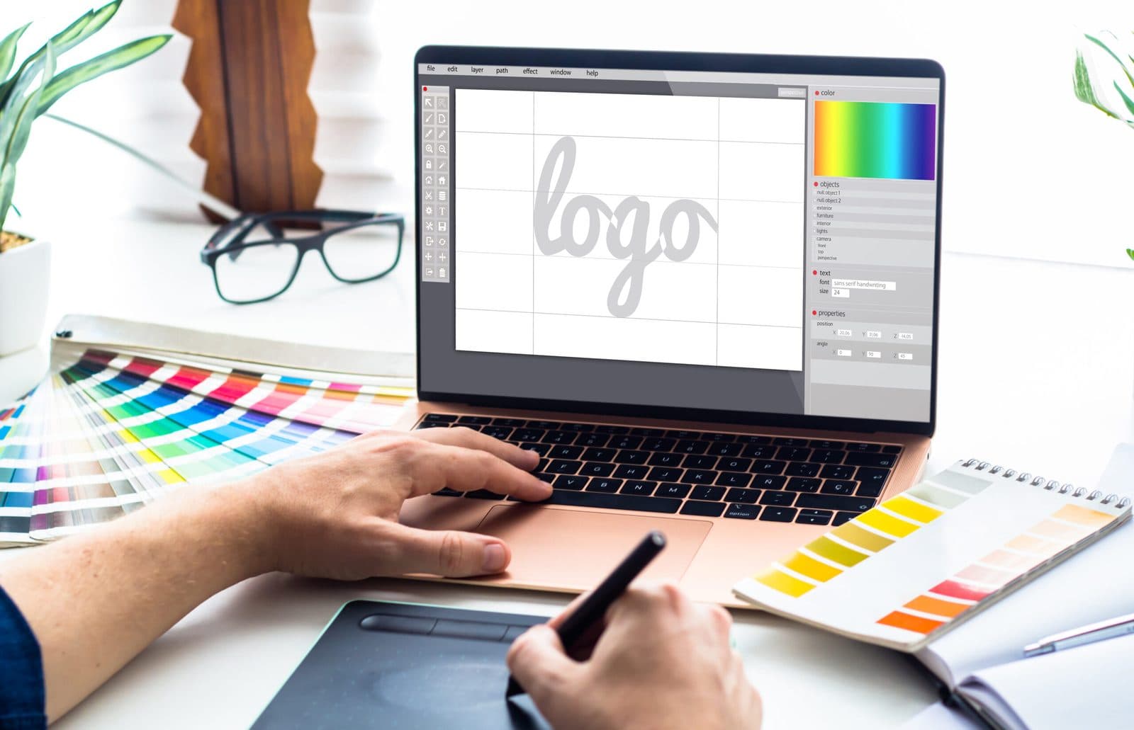
Look, I understand wanting to save money when you’re starting out. But a logo you threw together in Canva in 20 minutes will always look like a logo you threw together in Canva in 20 minutes.
Your logo is an investment in your brand. It’s worth getting right from the start, rather than trying to build a business around an amateur logo and having to rebrand later.
Versatility Matters More Than You Think
Your logo needs to work in multiple formats:
- Full color version
- Single color version
- Black version
- White version
- Horizontal layout
- Square layout for social media
If you only have one version of your logo, you’re going to run into problems constantly.
Typography That Doesn’t Scream “Amateur”
Using trendy fonts might seem like a good idea now, but fonts go out of style quickly. What looks modern today might look dated in two years.
Classic, well-designed typefaces last. They work across different contexts. They don’t distract from your message.
The Icon vs Wordmark Decision
Some brands work better with just text (a wordmark). Others need an icon that can work on its own.
If you’re building a personal brand, you might not need an icon at all. Your face is your brand. But if you’re building a gym, a coaching business, or a product company, an icon gives you more flexibility.
Brand Guidelines You Actually Need
Getting a logo file isn’t enough. You need:
- The actual logo files in multiple formats (AI, EPS, PNG, SVG)
- Color codes (hex, RGB, CMYK)
- Font information
- Clear guidance on how to use the logo
- Examples of what not to do with it
Without this, everyone who touches your brand (designers, printers, web developers) will interpret it differently. Your brand will look inconsistent.
When to Rebrand vs Refine
Not every logo needs a complete redesign. Sometimes a refresh is enough. Updating colors, refining the typography, modernizing the layout while keeping the core identity.
But if your logo is actively holding your business back or doesn’t reflect who you are anymore, a full rebrand might be necessary.
The Personal Brand Question
If you’re building a personal brand as a coach or trainer, do you even need a logo? Maybe not.
Your name in a nice typeface might be enough. Add a consistent color palette and style to your content, and that becomes your brand identity.
Some of the most successful coaches I work with don’t have traditional logos. They have a consistent visual style that’s immediately recognizable.
Logo Trends to Avoid
Anything overly trendy will date quickly. That gradient effect that everyone’s using right now? It’ll look dated in two years.
Complicated illustrations that don’t scale well. Generic fitness icons (barbells, dumbbells, flexing arms). Following whatever everyone else in your industry is doing.
Making Your Logo Work For You
Your logo should make you look professional and credible. It should be flexible enough to work across all your marketing. It should be memorable without being gimmicky.
Most importantly, it should reflect your actual brand. Not what you think a fitness brand should look like. Not what’s trendy right now. What makes your business unique.
If your logo isn’t doing these things, it’s worth fixing. Because first impressions matter, and your logo is often the first impression potential clients get of your business.