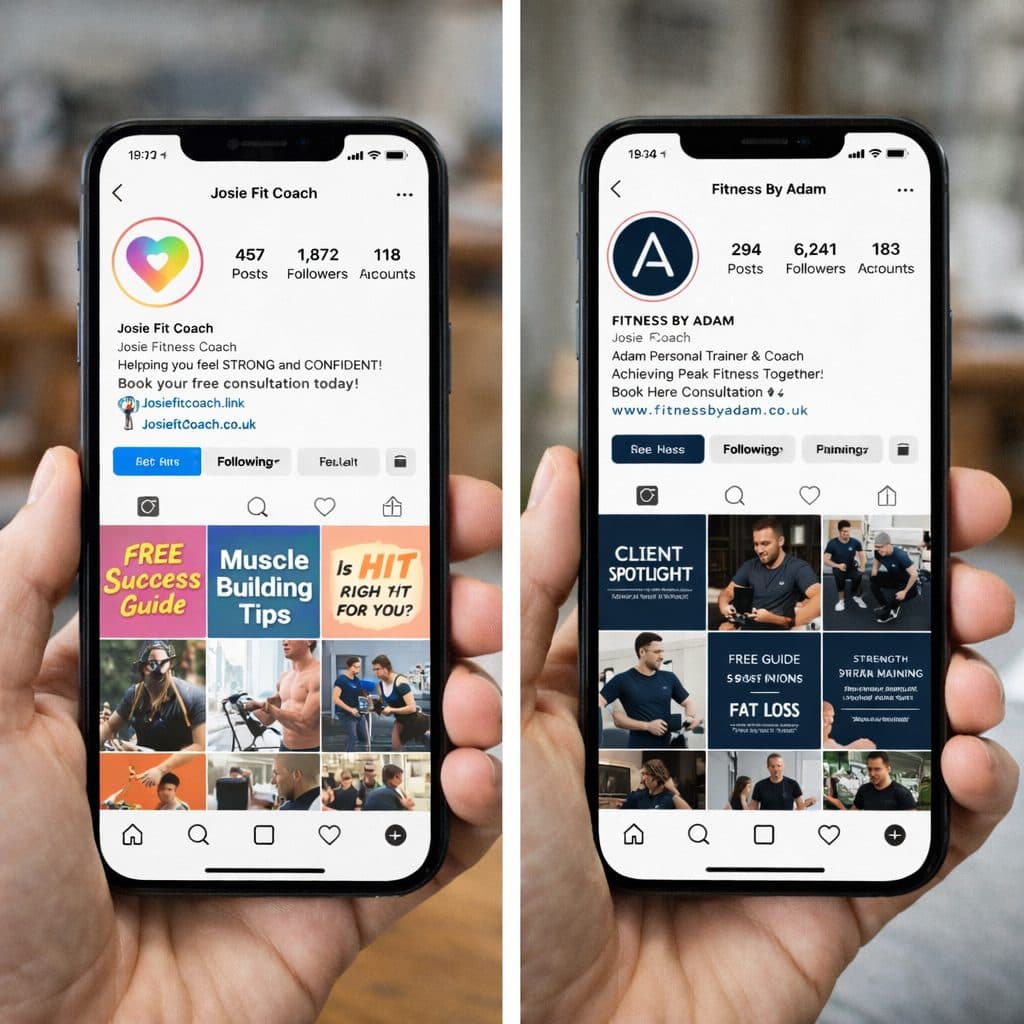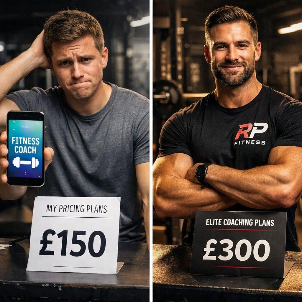
I’ve built websites for gyms, CrossFit boxes, and fitness studios for years. And I can tell you right now: most of them look exactly the same. Same layouts. Same stock photos of people working out. Sa
I’ve built websites for gyms, CrossFit boxes, and fitness studios for years. And I can tell you right now: most of them look exactly the same. Same layouts. Same stock photos of people working out. Same generic “Join Today” buttons.
Here’s the problem with that. If your website looks like every other gym’s website, why would someone choose you?
The Cookie-Cutter Gym Website Template
You know the one. Hero image of someone doing a deadlift. “Transform Your Body” headline. Three boxes listing your services. Some testimonials. Contact form at the bottom.
It’s not that this layout is wrong. It’s that it’s boring. It tells potential members nothing about what makes your gym different.
What Makes Your Gym Actually Different
Every gym owner I talk to can tell me exactly what makes their gym special. Maybe it’s the community. Maybe it’s the coaching. Maybe it’s that they specialize in helping people with gym anxiety feel comfortable.
But none of that comes across on their website. Instead, they’ve got generic copy that could apply to any gym anywhere.
The Information Your Website Actually Needs
When someone lands on your gym’s website, they’re asking specific questions:
Is this gym for someone like me? What’s the vibe like? How much does it cost? What makes this different from the gym down the road?
Your website needs to answer these questions immediately. Not three pages deep. Not in a PDF they have to download. Right there on the homepage.
The Pain Point Approach
This is something I push hard with all my gym clients. Your website needs to address specific pain points.
If your ideal member is someone struggling with gym anxiety, your homepage should speak directly to that. “If you’re intimidated by traditional gyms, here’s how we make you feel welcome from day one.”
If your ideal member is a busy parent, speak to that. “Training designed for people with limited time and unlimited responsibilities.”
Generic messaging attracts generic members. Specific messaging attracts your ideal members.
Why About Pages Miss the Mark
Most gym about pages are just a list of qualifications and years of experience. Nobody cares. I’m being harsh, but it’s true.
What people actually want to know is: do you understand what I’m going through, and can you help me?
Your about page should tell your story in a way that makes potential members think “this person gets it.” Not “this person has a lot of certificates.”
The Pricing Transparency Debate
I see gyms hide their pricing all the time. They want people to book a tour first. I get the logic, but here’s what actually happens:
People who can’t afford your gym waste time booking tours. People who can afford it but hate pushy sales tactics bounce from your website.
You don’t need to list exact prices for everything. But give people a rough idea. “Memberships from £40/month” tells them enough to know if they should keep looking.
Mobile Optimization That Actually Matters
More than half of people looking at gym websites are on their phones. Usually during their commute or lunch break. If your website doesn’t work well on mobile, you’re losing them.
This isn’t just about the site loading. It’s about the experience. Can they easily find your timetable? Can they book a tour in three taps? Can they see your location and opening hours without scrolling forever?
The Power of Video on Gym Websites
A quick video tour of your gym is worth more than 20 stock photos. Show the space. Show the equipment. Show real members training.
Video builds trust in a way that nothing else can. It shows you’re a real gym with real people, not just another template website.
Social Proof That Actually Convinces
Testimonials work, but only if they’re specific and believable. “Best gym ever” doesn’t convince anyone.
What works is specific transformation stories. “I was nervous about joining a gym for the first time, but the coaches made me feel comfortable from day one. Six months later, I’m stronger than I’ve ever been.”
Photos help. Video testimonials are even better. The more real it feels, the more convincing it is.
What a High-Converting Gym Website Looks Like
Here’s what I typically structure for gym clients:
A hook that speaks directly to their ideal member’s situation. A video or image slider showing the gym and real members. Clear explanation of what makes them different. Social proof from real members. Easy path to book a tour or trial. Practical information like location, times, and rough pricing.
That’s it. No complicated navigation. No 15 different pages. Just the information someone needs to decide if your gym is right for them.
The Landing Page Alternative
For some gyms, especially smaller ones or those focused on a specific niche, a landing page works better than a full website.
One focused page that tells the story, addresses the pain points, shows social proof, and makes it easy to book a trial. No distractions. No navigation taking people away.
I’ve seen landing pages convert at three times the rate of full websites for gyms. Because they’re built for one purpose: getting people through the door.
Common Mistakes That Kill Conversions
Auto-playing music or videos. Nobody wants that. Pop-ups that appear immediately. Let people actually see your site first. Making people fill out huge forms just to ask a question. Keep it simple. Outdated photos or information. If your timetable is wrong, people lose trust immediately.
Getting Your Gym Website Right
Your website should work as hard as your coaches do. It should be bringing in enquiries, booking tours, and converting visitors into members.
If it’s not doing that, it’s time to look at what’s actually on the page. Is it speaking to your ideal members? Is it addressing their specific concerns? Is it making it easy for them to take the next step?
Your gym is probably brilliant. Your website should show that. Not through generic claims, but through specific, authentic content that makes the right people think “this is the gym for me.”