
Floyd Dunlop Coaching
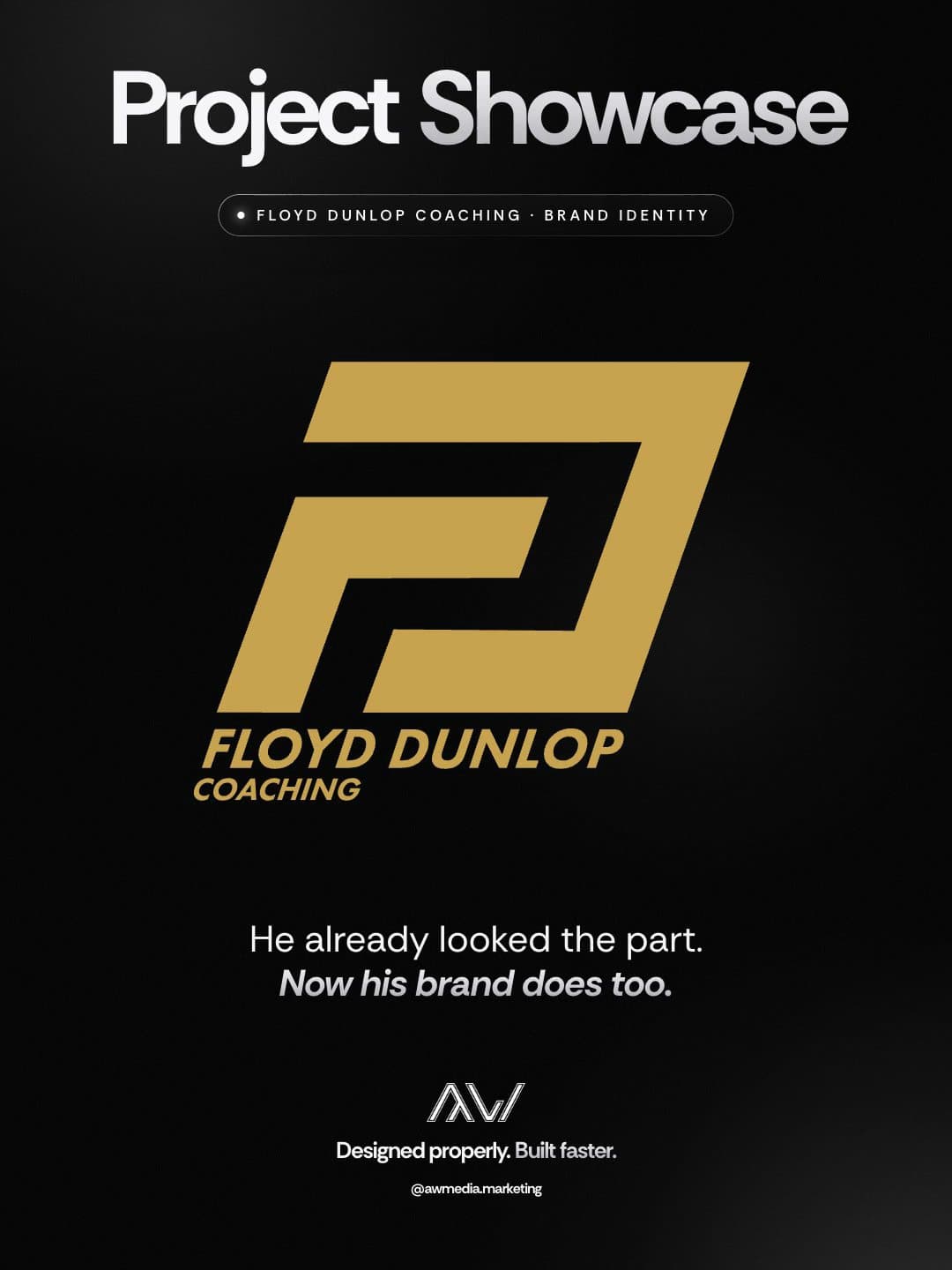
Floyd coaches busy professionals to lose fat and build lean muscle without their social or working life falling apart. His coaching was ready. His brand hadn't started: no logo, no colours, nothing to put on a profile, a post or a welcome pack. We built it from the mark up.
Client
- Name
- Floyd Dunlop / Floyd Dunlop Coaching
- Industry
- Online Coaching
The challenge.
A new coaching business gets judged on the first thing anyone sees, and there was nothing to see yet. No mark, no colours, no type.
It had to work everywhere from day one: a profile picture, highlight covers, posts and a welcome pack for every new client.
His welcome pack was already written in his own words, and it had to stay that way.
Our approach.
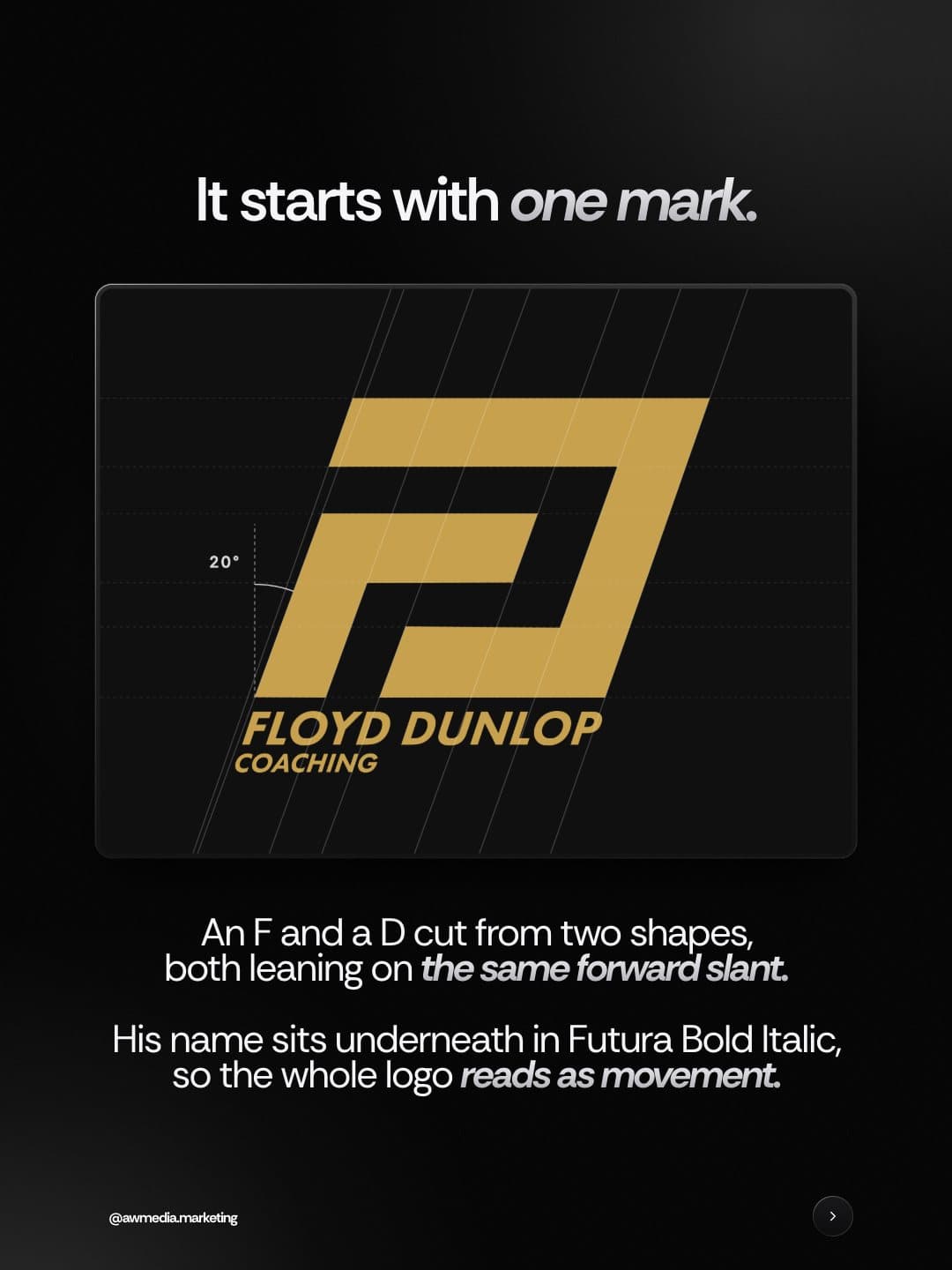
It starts with one mark. An F and a D cut from two shapes, both leaning on the same forward slant, with his name underneath in Futura Bold Italic so the whole logo reads as movement.
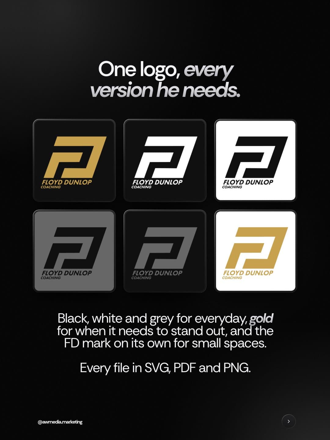
Every version he needs: black, white and grey for everyday, gold for when it needs to stand out, and the FD mark on its own for small spaces. Every file in SVG, PDF and PNG.
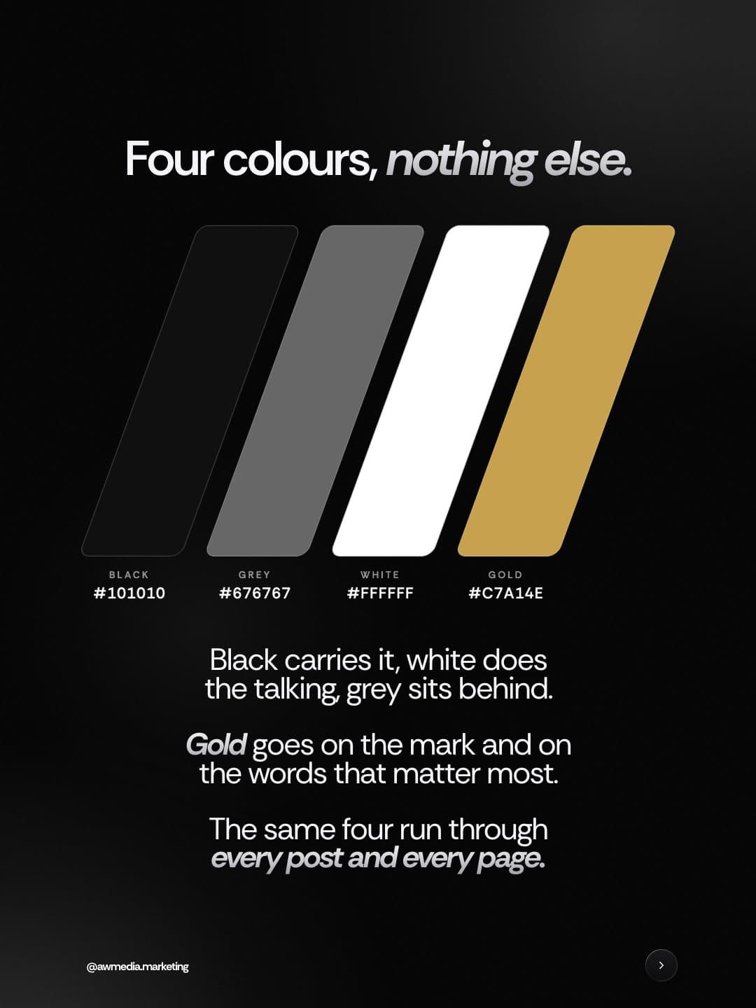
Four colours, nothing else. Black carries it, white does the talking, grey sits behind, and gold goes on the mark and the words that matter most. Anton, slanted to match, for the headlines, with Futura underneath so the long copy stays easy to read.
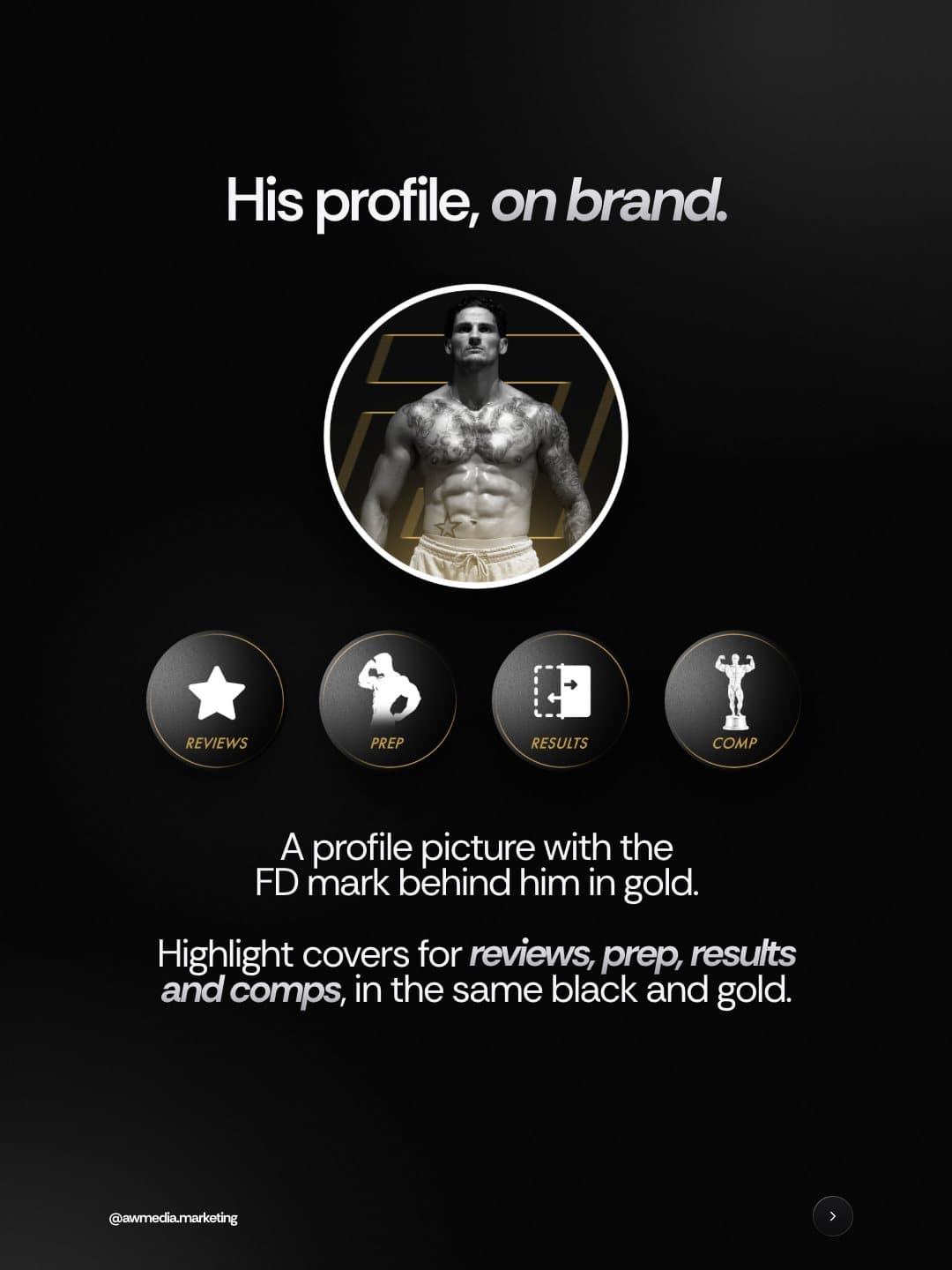
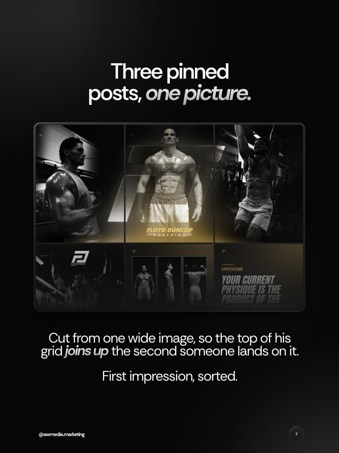
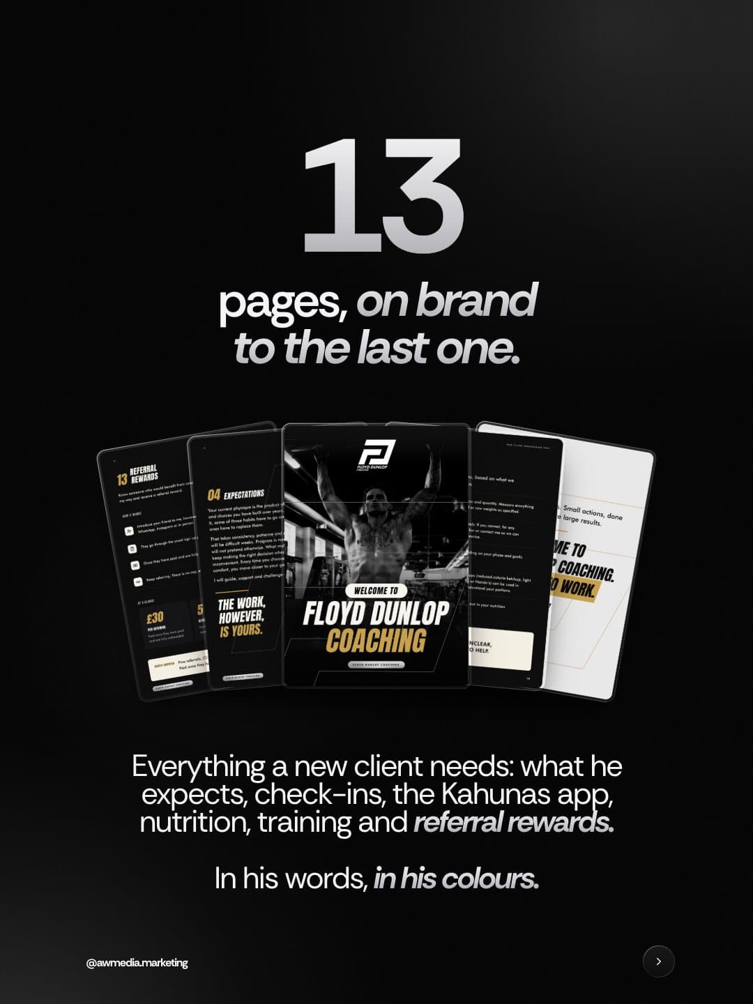
Then everything it touches. A profile picture with the FD mark behind him in gold, highlight covers, three pinned posts cut from one wide picture, three carousels in his own words and a 13-page welcome pack, on brand to the last page.
Brand showcase.
One mark on one slant, then everything it touches: the logo suite, the colours, his profile, the pinned row and the welcome pack.
What we built.
- Logo and FD mark on one forward slant
- Full logo suite in SVG, PDF and PNG
- Four colour system + type pairing
- Brand guidelines
- Profile picture, highlights + pinned row
- Three carousels + a 13-page welcome pack
More projects.
DC Carpentry & Construction
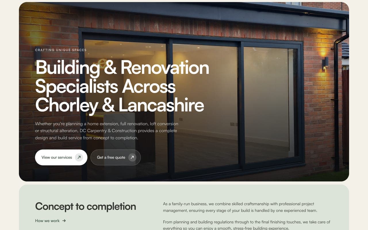
DC Carpentry & Construction are a family-run building company in Chorley, run by Natasha and Dale: extensions, structural work, kitchens and bespoke carpentry across Lancashire. Their old website had gone live before it was finished. We rebuilt it from scratch around Natasha's own words: 40 pages, their projects told stage by stage in their own photos, a page for each of the 20 towns they work in, and a quote form that finally goes somewhere.
Harcon Solutions
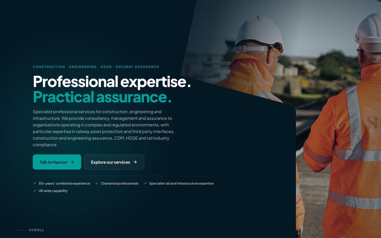
Harcon Solutions are a specialist consultancy for construction, engineering and the railway, trading since 2017 with over 50 years of combined experience between them. Their old WordPress site looked the part but made people work to get in touch. We rebuilt it from scratch on their own look: 24 pages, Railway Asset Protection first, an enquiry form on every service page, and every old link still landing in the right place.
SBS Building & Damp Proofing
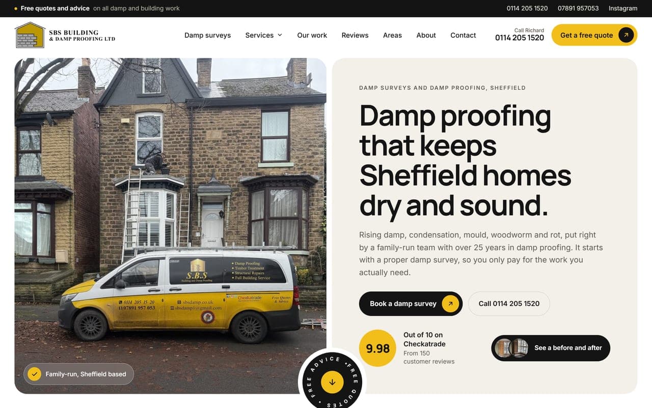
Richard Wright runs a family damp proofing and building firm in Sheffield, with over 25 years in damp proofing and 9.98 out of 10 on Checkatrade from 150 reviews. The old website stopped scrolling halfway down the page, so most visitors never reached the phone number. We rebuilt it from scratch: fifteen pages, damp surveys first, their own photos and their customers' own words.
Like whatyou see?
Let's build something like this for your business.
See our 314 reviews on Trustpilot