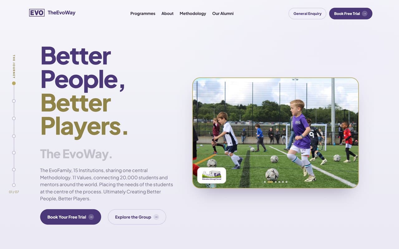
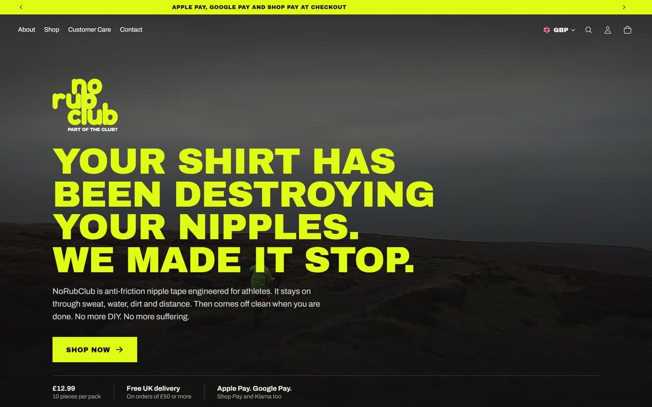
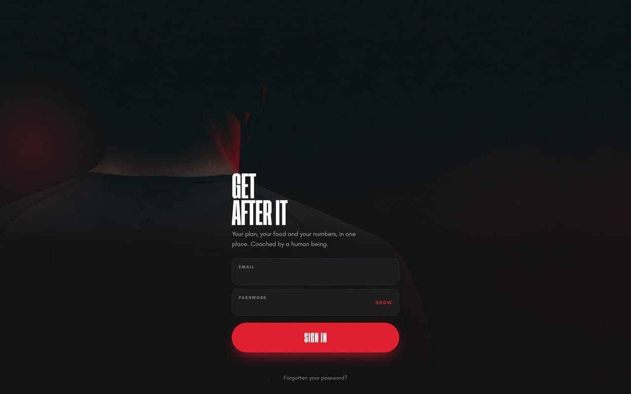
Dr Shabri
A Marylebone practice that treats dentistry, facial aesthetics and regenerative health as one discipline rather than three departments. The website had to carry that idea across more than sixty pages without ever feeling like a treatment menu, book patients into three different clinical systems without dumping them in the wrong one, and be found by people searching for a treatment rather than for her name.
Client
Name
Dr Shabri Chandarana
Industry
Cosmetic Dentistry & Facial Aesthetics
Location
Marylebone, London
Website
Visit live site →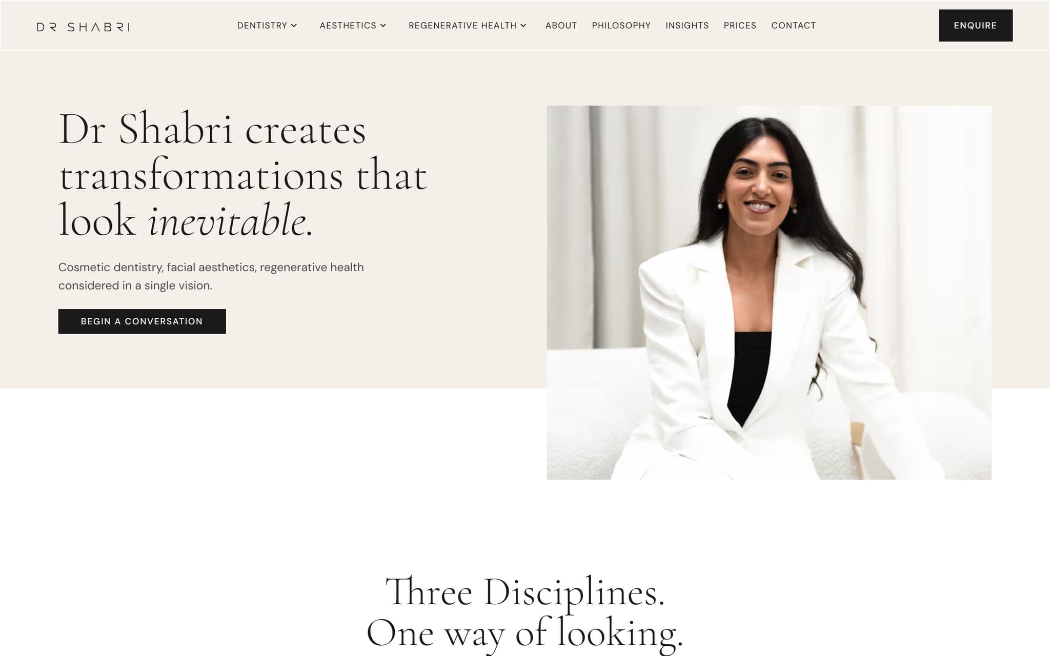
Thechallenge.
Sixty six pages, most of them treatments. On a site that size the danger is not the design, it is drift. Wording, buttons, headings and page furniture pull apart page by page until the twentieth treatment page reads like a different practice from the first.
Booking runs through separate clinical systems for dentistry, aesthetics and skincare. Every enquiry button had to land a patient in the right one, and the site was routing them through popups that added a step and lost people.
The practice writes in the first person, but large parts of the site said we and our, which reads as a clinic full of people when the whole proposition is that one clinician plans the treatment.
Patients search for the treatment, not the practice. Someone typing composite bonding or tear trough filler into Google has never heard of Dr Shabri, so every treatment page had to be able to win that search on its own.
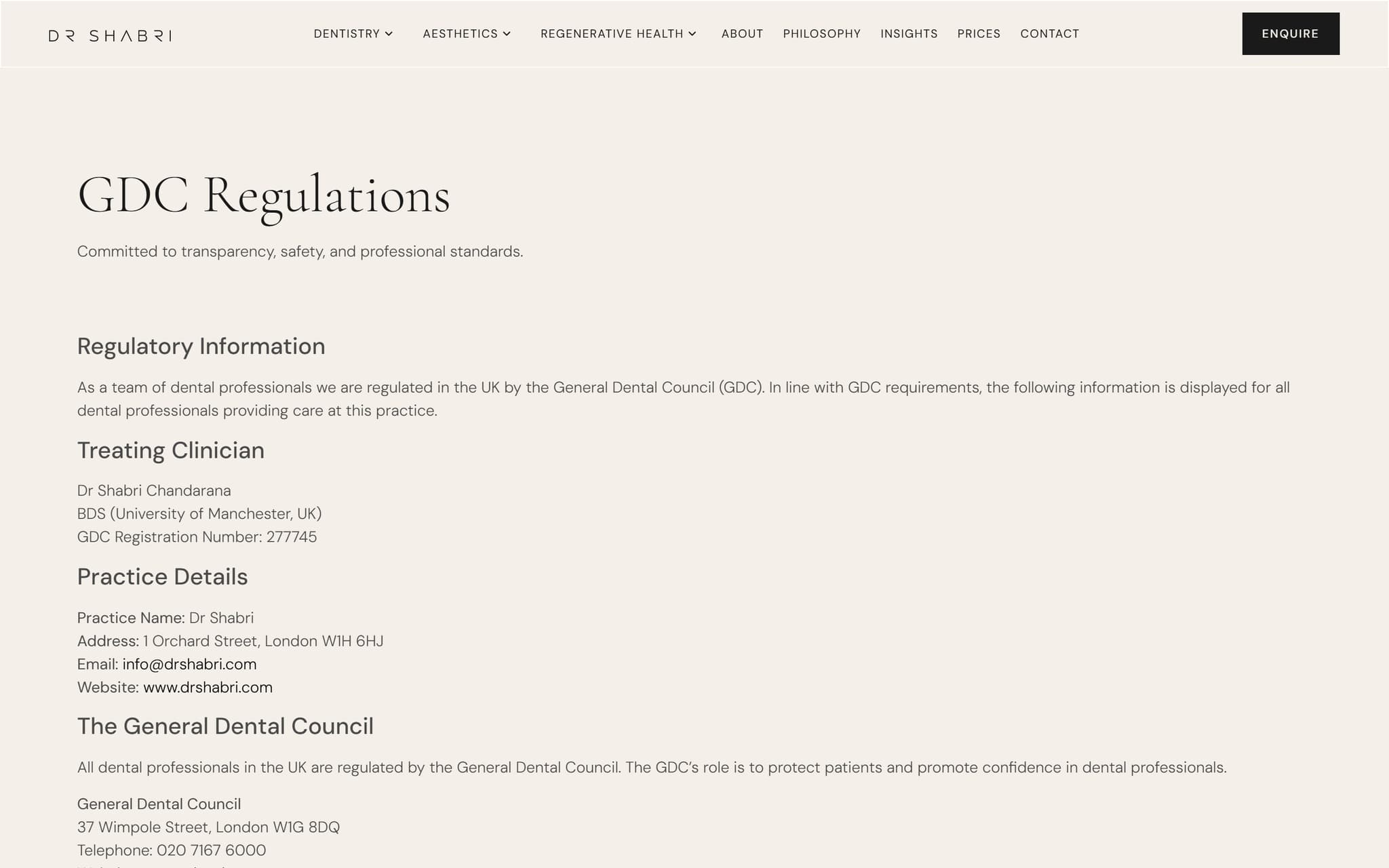
Dental practices are regulated. GDC-required information has to be published and correct, and the practice address has to be right everywhere it appears, which on a site like this is more places than anyone expects.
Ourapproach.
One design system, applied everywhere rather than page by page. Where a change touched dozens of pages we scripted it against the page data instead of opening each one, so the fortieth treatment page came out identical to the first.
Booking popups replaced with buttons that go straight to the right portal. Sixty seven of them across forty four pages, split three ways so a dental patient, an aesthetics patient and a skincare patient each land where they should.
Every page given its own hand-written title, description and target search term. Not generated, not templated. All sixty six were then read back off the live page to prove what we wrote is what Google sees.
The practice published in a form search engines and AI assistants can read: the clinic as a named dental practice with its address, map position, opening hours and phone number, rather than leaving that buried in the footer as ordinary text.
Alt text written for ninety six images from where each image actually sits on the page, taking its meaning from the section it illustrates rather than from a filename.
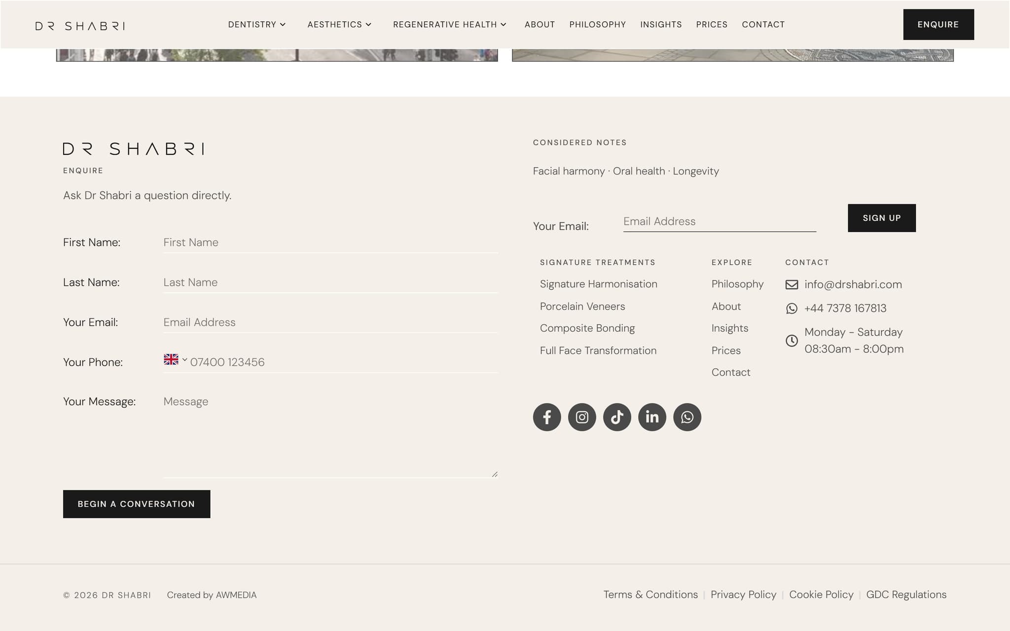
The footer rebuilt into two columns and locked to the same width as the band above it, measured across five screen widths rather than eyeballed, so the edges line up on every machine.
The address verified against the postcode database before it was allowed anywhere near the site's structured data. On this site that mattered more than usual, because the regulatory page also carries the GDC's own address, and mixing the two up would have put the wrong practice on the map.
Thework.
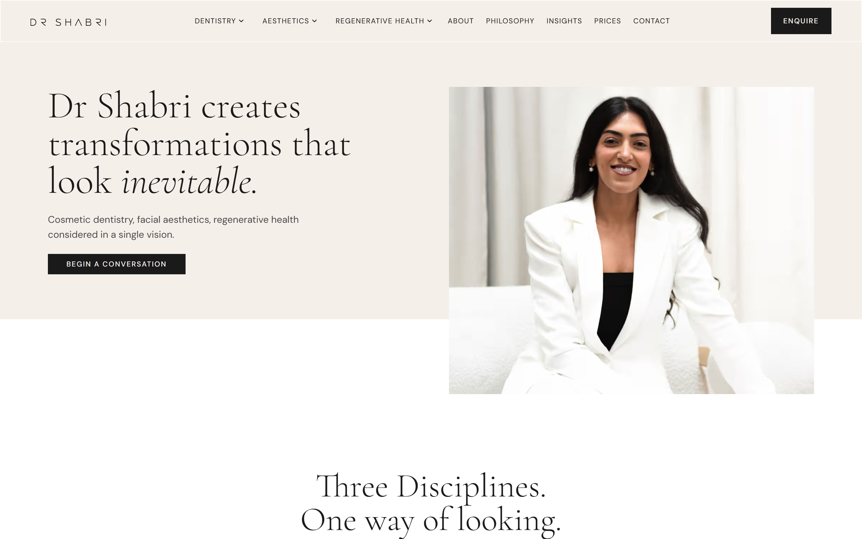
Scroll inside the window to explore, or open the live site.
Sixty six pages thatread as one practice.
The work on a site this size is consistency. Every treatment page carries the same structure, the same tone and the same route to an enquiry, so a patient who arrives on skin boosters from a Google search gets the same practice as one who arrives on the homepage. The regulatory page is held to the same standard as the rest, because a dental site is judged on that too.
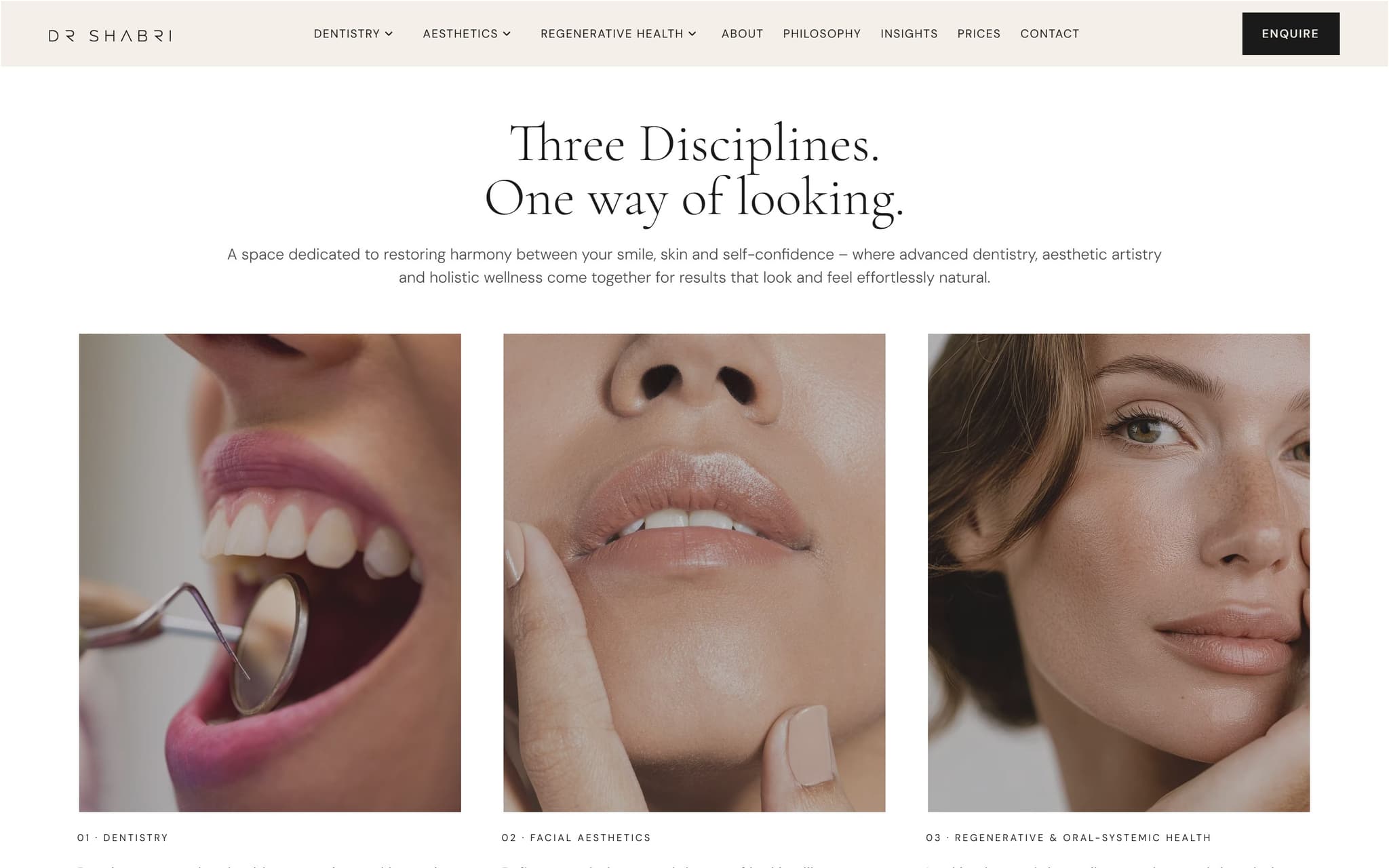
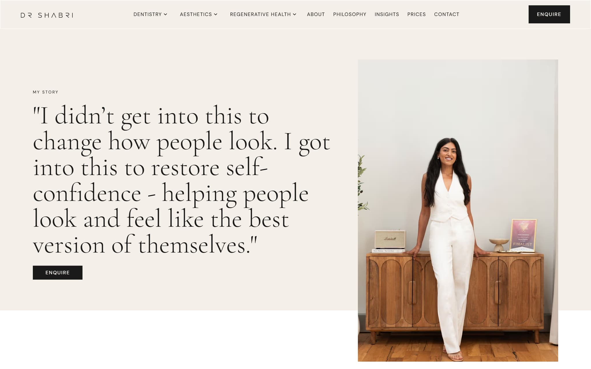
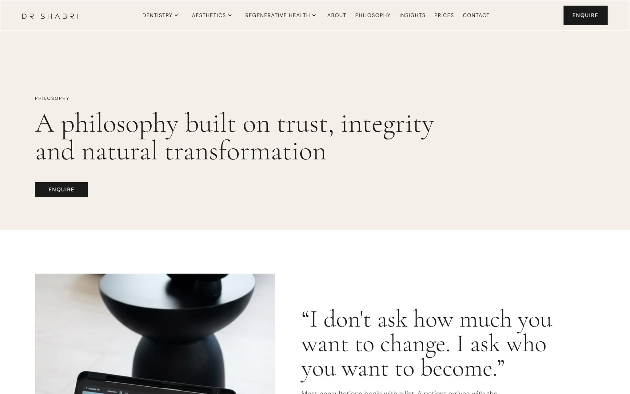
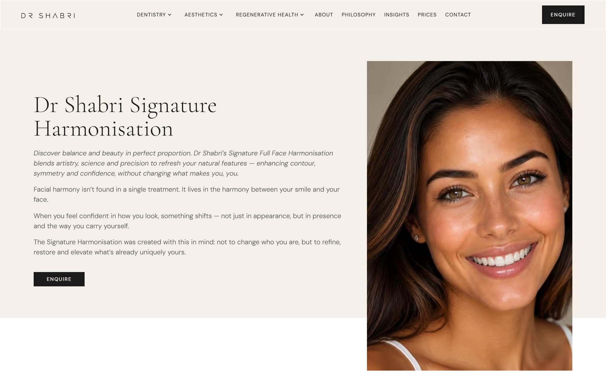
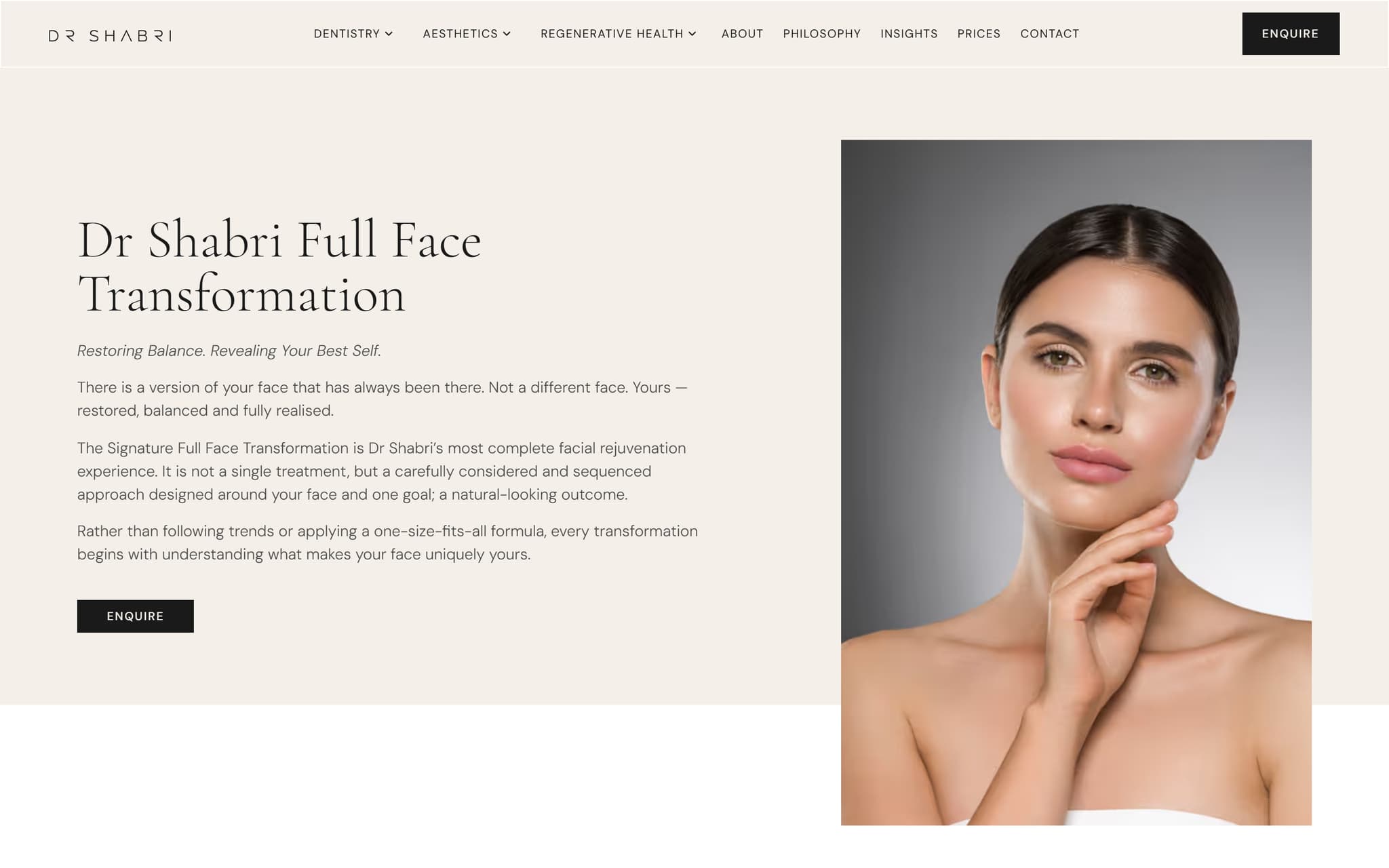
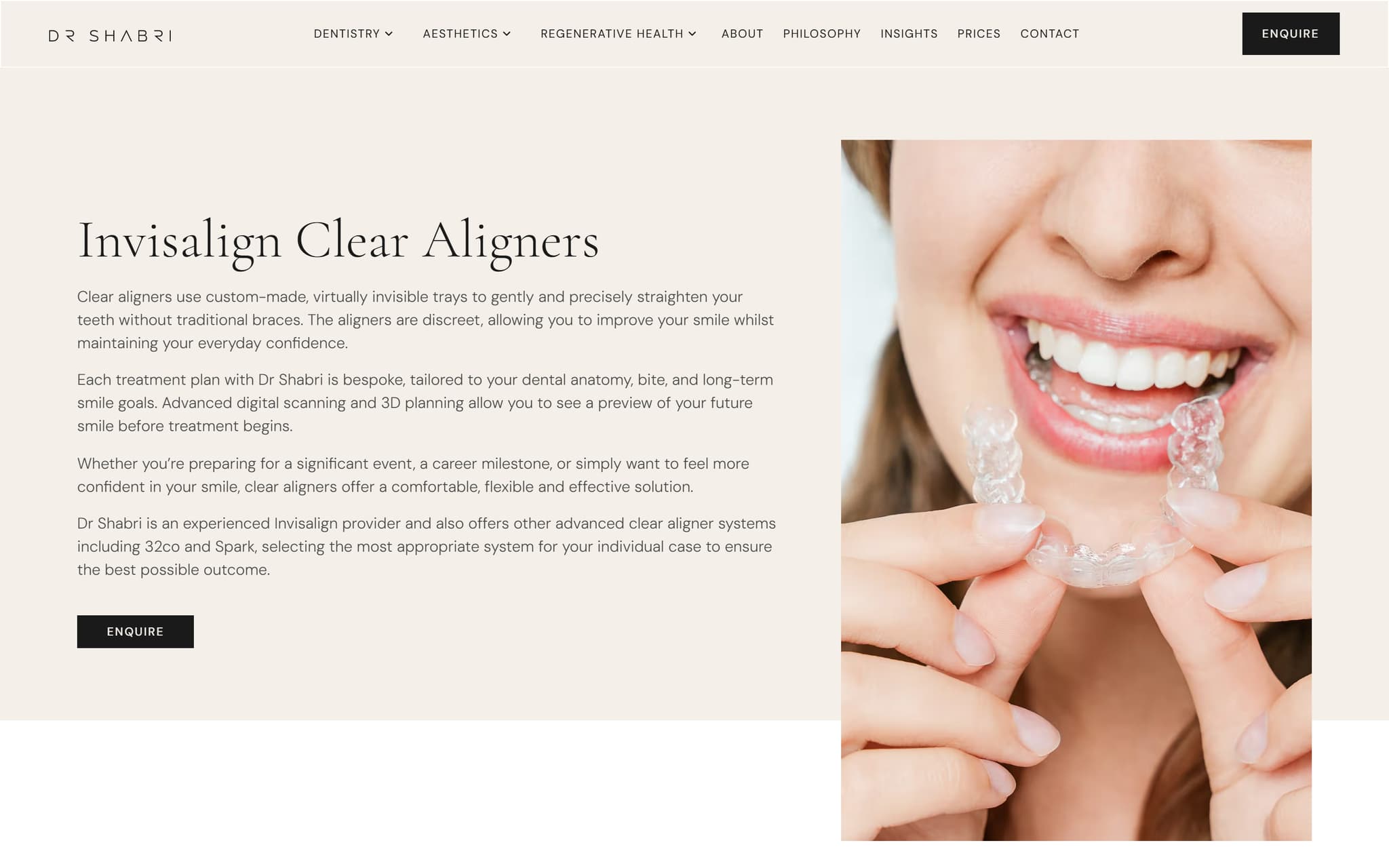

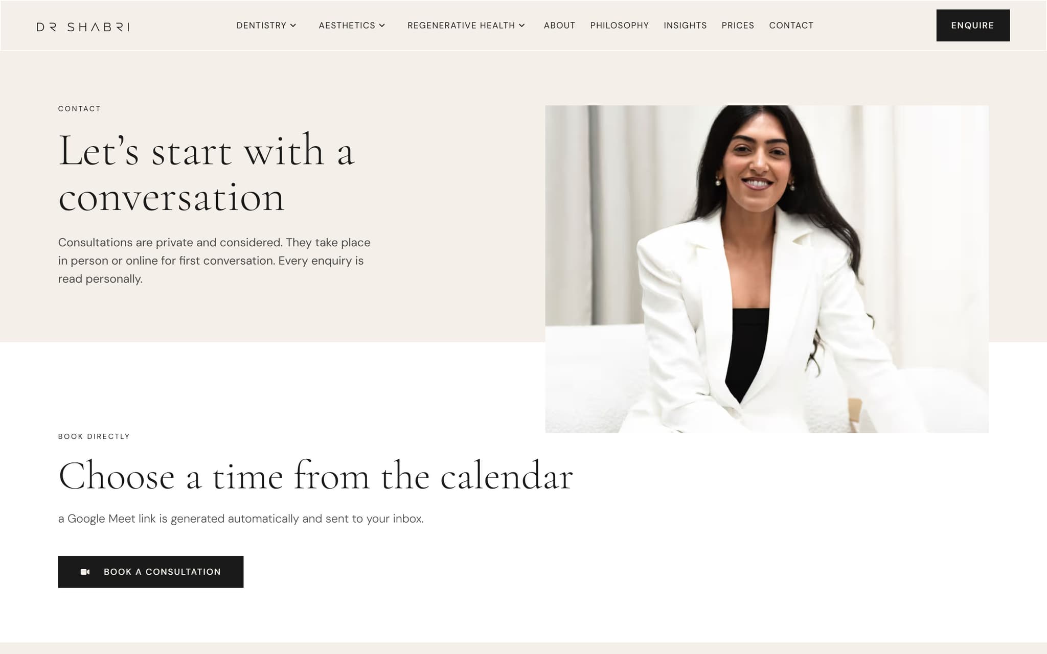
What webuilt.
- ✓Sixty six pages on one consistent design system
- ✓Treatment pages built to win their own search
- ✓Booking routed to three separate clinical portals
- ✓Direct-to-portal buttons, no popup in the way
- ✓Named dental practice markup with address and hours
- ✓Hand-written titles and descriptions on every page
- ✓Alt text taken from context, not filenames
- ✓GDC regulatory information published properly
- ✓Two-column footer with a working enquiry form
- ✓New treatment pages added inside the same system
- ✓Cached delivery for a fast repeat visit
- ✓Ongoing changes handled as the practice grows
Thenumbers.
66 pages
Each with its own hand-written title, description and target search term, every one verified on the live page
67 popups
Replaced with buttons that take a patient straight to the right booking system, across 44 pages
230ms
Warm page load on a sixty six page Elementor site
5 new pages
Built and published inside the existing design system, including the regulatory page the practice must show